Did you know that for every 92 dollars spent on customer acquisition, only 1 dollar goes toward converting those visitors into customers?
If you are running an ecommerce store, SaaS platform, or lead generation website, that is a massive missed opportunity. The good news is that conversion rate optimization does not require more traffic or bigger budgets. Small, data-driven tweaks to your site can boost conversions by 15% to 500%, depending on where you start and what you fix. This comprehensive conversion rate optimization checklist walks you through every essential element, from page speed and mobile UX to trust signals and A/B testing, so you can turn more browsers into buyers without spending another dollar on ads.
What is Conversion Rate Optimization?
Conversion rate optimization (CRO) is the systematic process of increasing the percentage of website visitors who complete a desired action, whether that is making a purchase, signing up for a trial, booking a demo, or submitting a lead form. Unlike traffic generation, CRO focuses on maximizing the value of visitors you already have.
For ecommerce businesses, conversions typically mean completed purchases or add-to-cart actions. SaaS companies track free trial sign-ups, demo requests, and upgrades. Lead generation sites measure form submissions, phone calls, and consultation bookings. The average conversion rate across all industries hovers around 2.5% to 3%, but companies that run systematic CRO programs see rates climb well above 5%.
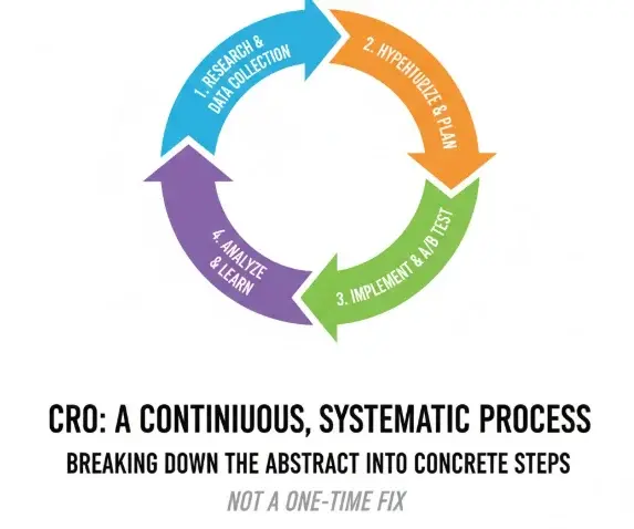
CRO is not a one-time fix but a repeatable, data-driven cycle that involves five key stages: research (analytics, heatmaps, surveys, session replays), hypothesis (identifying problems and proposing solutions), testing (A/B tests, multivariate tests), analysis (measuring statistical significance and impact), and iteration (applying learnings to new tests).
This method ensures every change you make is grounded in real user behavior, not guesswork. Companies that follow this framework typically see a 20% to 30% win rate on their tests, meaning one in three or four experiments successfully improves conversion metrics.
Quick CRO Audit Checklist

Before diving into detailed optimizations, use this rapid diagnostic checklist to identify the most critical issues on your site. Print it, share it with your team, or use it as a starting point for prioritizing fixes. Each item includes a pass or fail assessment and a recommended next action so you can move quickly from audit to implementation.
Conversion Optimization Checklist
A professional checklist for website performance
0 / 15 items completed
Research and Analytics Foundations
Effective conversion rate optimization starts with understanding how users actually behave on your site, not how you think they behave. Install comprehensive analytics tracking to capture every key event in your funnel, from landing page views to product adds, form starts, and completed conversions.
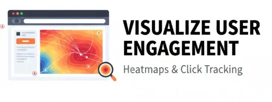
Use funnel reports to identify where visitors drop off, heatmaps and click tracking to see what users engage with, session replays to watch real user journeys, and on-site surveys or feedback tools to capture voice-of-customer insights. Form analytics reveal which fields cause friction, while user testing sessions uncover usability issues you may never notice on your own.
Once your tracking is in place, define success metrics and establish baselines so you know what good looks like and can measure progress. Track your overall conversion rate (completed conversions divided by total visitors), click-through rates on key CTAs, bounce rates by traffic source, form completion rates, and revenue per visitor or lead quality scores. For example, if your product detail page to add-to-cart rate is currently 6.2%, set a target to increase it by 15% over the next six weeks. Document these baselines in a shared dashboard so your entire team understands the starting point and can celebrate wins as you improve.
Technical Performance and Speed
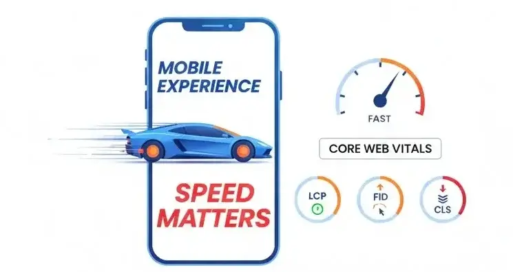
Page speed directly impacts conversions because users abandon slow sites before they ever see your offer. Research shows that a one-second delay in mobile page load time can reduce conversions by 7%, and a three-second delay drops conversions by 20%. When load times exceed three seconds, 53% of mobile users abandon the page entirely.
Fast load times require image compression (use modern formats like WebP and lazy loading for below-the-fold images), script minimization (combine and defer non-critical JavaScript), and optimized hosting or content delivery networks to serve assets quickly worldwide.
Monitor Core Web Vitals to ensure your site meets modern performance standards set by Google and expected by users. Aim for Largest Contentful Paint under 2.5 seconds (the time it takes for the main content to load),
First Input Delay under 100 milliseconds (how quickly the page responds to user interaction), and Cumulative Layout Shift under 0.1 (how much content jumps around while loading). Audit your site regularly using tools like Google PageSpeed Insights or Lighthouse, and prioritize fixes that have the biggest impact on real-world user experience, especially on mobile devices where most traffic originates.
Mobile-First Usability
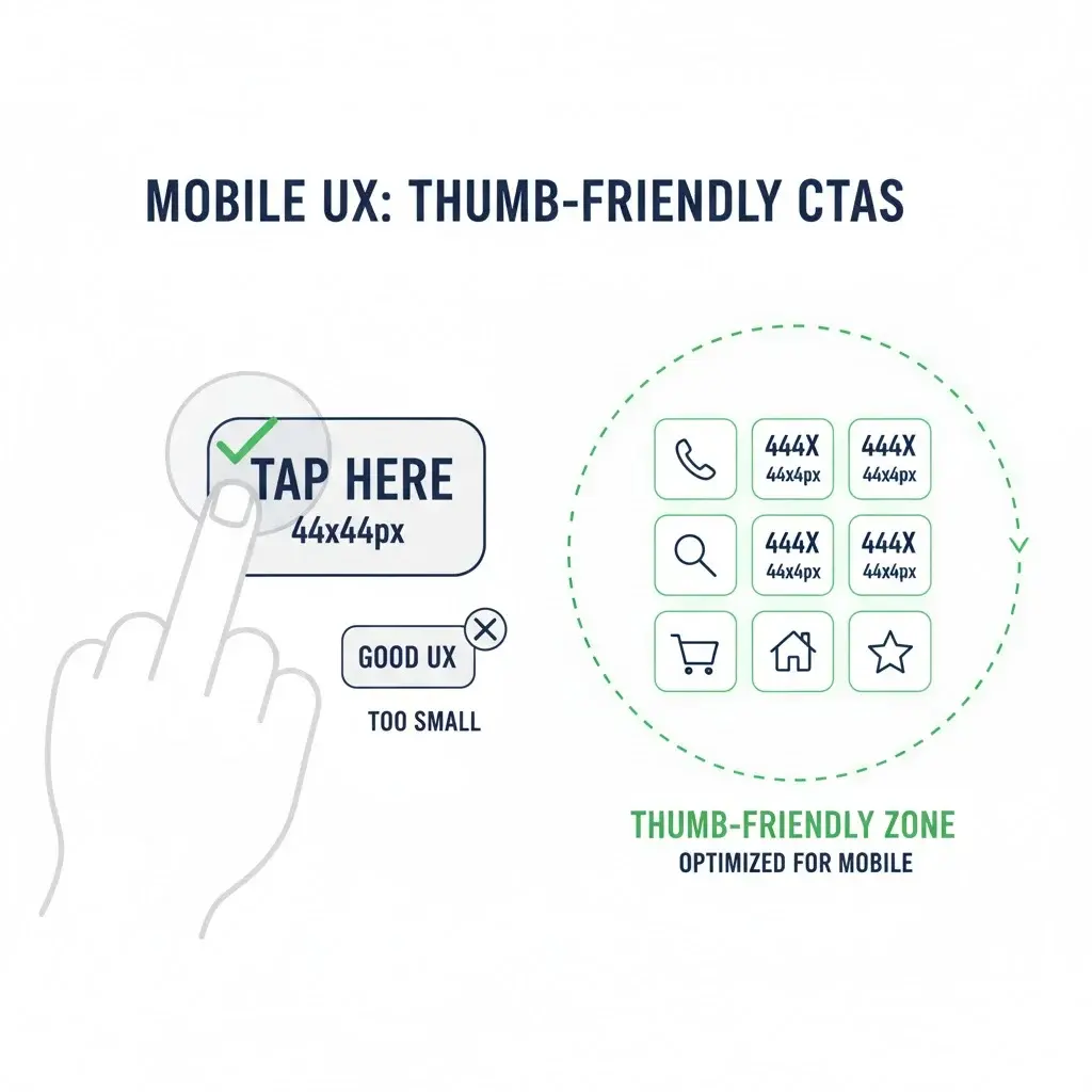
Mobile devices account for 79% of all landing page visits, yet mobile conversion rates lag behind desktop at just 2.3% compared to 2.8% on desktop. This gap represents a massive opportunity to capture more conversions by optimizing for the mobile experience. Start by ensuring fully responsive layouts that adapt gracefully to any screen size, then make tap targets at least 44 by 44 pixels so users can easily click buttons without accidentally hitting the wrong element. Use readable typography with font sizes of at least 16 pixels for body text, and implement sticky CTAs that stay visible as users scroll so the next step is always clear.
Simplify navigation for small screens by using hamburger menus or bottom navigation bars, reduce the number of form fields on mobile to minimize typing, and remove unnecessary content or images that slow load times or clutter the screen. Test your mobile experience on real devices, not just desktop browser emulators, because touch interactions and network speeds behave differently in the real world. Even small improvements to mobile usability can lift conversions by 8% to 10%, making mobile optimization one of the highest-impact areas of your conversion rate optimization checklist.
Navigation and Information Architecture
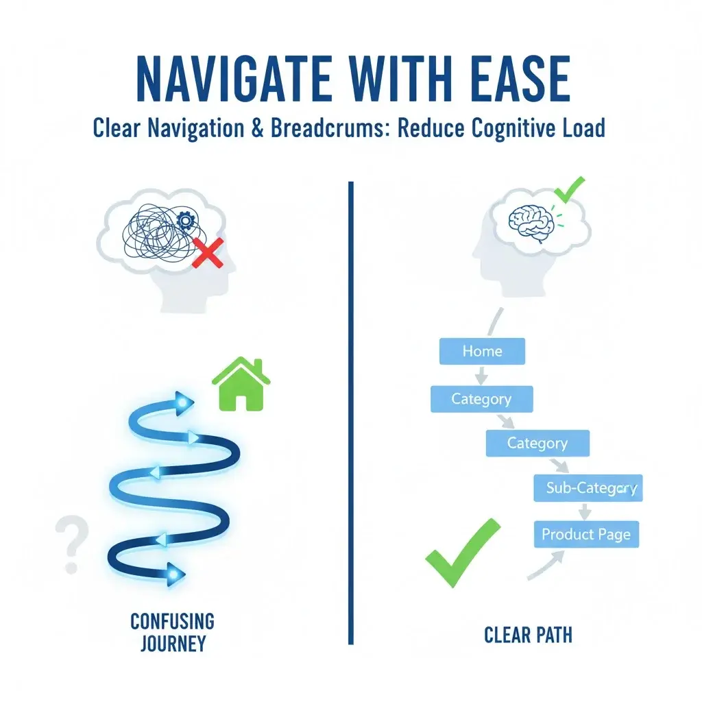
Clear, predictable navigation helps users find what they need quickly and confidently, which directly improves conversion rates. Use concise menu labels that match the language your customers use, implement breadcrumbs on category and product pages so users always know where they are, and add a search function that tolerates typos and offers helpful suggestions.
For ecommerce sites, provide filters and sorting options that let users narrow results by price, size, color, rating, or other relevant attributes without overwhelming them with too many choices.
Place your most important conversion paths in the primary navigation so users can reach key pages in one or two clicks. For example, include top tasks like Shop, New Arrivals, Sale, Support, and Cart in your header so visitors never have to hunt. Audit your navigation using session replay tools to see how real users interact with menus, and simplify any paths that require more than three clicks to reach a conversion point. Simple navigation reduces cognitive load, builds trust, and keeps users moving forward through your funnel instead of bouncing in frustration.
Messaging and Value Proposition

Your value proposition tells visitors why they should care about your product or service, and it needs to be crystal clear within the first five seconds of landing on your site. Use a headline that immediately communicates who your product is for, what it does, and the primary benefit users will gain. Follow a simple formula: Outcome plus timeframe plus objection handling. For example, “Launch your store faster without hiring more developers” tells SaaS buyers exactly what they get and addresses their concern about resources in one sentence.
Maintain consistent messaging and tone across all pages so users never feel confused or like they have landed on a different site. Use the exact match main keyword naturally in your H1 heading, intro paragraph, and at least one H2 subheading to reinforce relevance for both users and search engines. Back up your headline with proof points like customer logos, testimonials, or quick stats that validate your claims. Weak or vague messaging is one of the most common conversion killers, so invest time in crafting clear, benefit-focused copy that speaks directly to your target audience.
Calls to Action

Your call to action (CTA) is the gateway to conversion, so it must be prominent, compelling, and impossible to miss. Make primary CTAs stand out visually with contrasting colors, generous white space, and a size that commands attention without looking out of place. Use action-oriented, benefit-driven text that tells users exactly what happens next and why they should click. Instead of generic labels like “Submit” or “Click here,” try “Get my free audit,” “See it in action,” or “Book 15-minute consult.”
Limit competing CTAs on each page because too many options reduce conversions by up to 266% according to research. When users face multiple buttons fighting for attention, decision paralysis sets in and they often choose to do nothing. Repeat your primary CTA after scrolled content and again near the bottom of long pages so users do not have to scroll back up to take action. A/B test different CTA variations to find which text, color, placement, and design drives the highest click-through and conversion rates, and document your findings so you can apply those learnings across your site.
Social Proof and Trust Signals
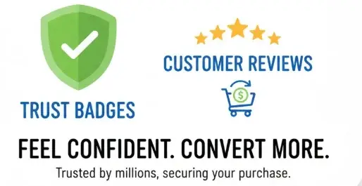
Trust signals remove doubt and anxiety at the exact moment users are deciding whether to convert. Place customer testimonials near objections or decision points, display star ratings and review counts on product pages, showcase client logos on your homepage or landing pages, and add guarantees like “30-day free returns” or “money-back guarantee” near your primary CTA. Security badges from recognized brands like Norton, McAfee, or BBB can lift conversions substantially when placed near checkout buttons or form fields because they reassure users that their payment data is protected.
Research shows that McAfee and Norton security seals are the most effective at increasing conversions, with some tests showing a 21.5% lift when these badges are displayed. Less-known badges from providers like Authorize.net or TrustGuard can actually lower conversions because users associate them with less professional sites. Choose trust signals that your target audience recognizes and values, then test placement and quantity to find the sweet spot. Too many badges can look cluttered and desperate, while too few leave users questioning your credibility, so aim for two to four high-quality trust elements strategically placed throughout your conversion funnel.
Forms and Checkout Optimization
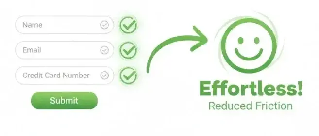
Forms are often the highest-friction point in your funnel, so every field you remove and every bit of clarity you add translates directly into higher completion rates. Shorten forms by removing non-essential fields and only asking for information you truly need at this stage. Mark optional fields clearly so users know what is required versus nice-to-have. Implement real-time validation that tells users immediately if they made an error, not after they hit submit. Show progress indicators for multi-step forms (Step 2 of 3) so users know how much more effort is required.
Enable autofill for common fields like name, email, and address to minimize typing, and offer guest checkout so users do not have to create an account before purchasing. Research shows that improving form user experience can boost conversion rates by up to 87%, and reducing form fields from eight to four can significantly increase completion rates. Use clear, friendly error messages that tell users exactly how to fix the problem (Your password must include at least one number), and place help text or tooltips near complex fields. Finally, optimize your checkout flow by listing all costs upfront (product, shipping, taxes) so users never encounter surprise fees that trigger cart abandonment.
Lead Capture and On-Site Prompts
Popups, slide-ins, and lead flows can be powerful conversion tools when used strategically, but they hurt user experience and conversions when overused or poorly timed. Offer real value in exchange for an email address, like a discount code, free ebook, exclusive checklist, or access to a helpful tool. Trigger popups based on user behavior rather than showing them immediately on page load. Exit-intent popups appear when a user moves their cursor toward the browser close button, scroll-triggered popups wait until a user has engaged with content, and idle-triggered prompts activate after a user has been inactive for a set time.
Make your lead capture prompts easy to close so users never feel trapped or annoyed, and avoid aggressive tactics like hiding the close button or showing multiple popups on the same session. Test different offers, headlines, and timing to find what resonates with your audience. For example, an exit-intent popup offering “Get 10% off your first order” can recover visitors who were about to leave, while a scroll-triggered prompt offering a “Free conversion rate optimization checklist PDF” rewards engaged readers. When done right, on-site prompts can significantly boost email list growth and lead generation without damaging the overall user experience.
Product Discovery and Recommendations
Personalized product recommendations help ecommerce sites increase average order value and conversion rates by guiding users toward items they are likely to buy. Display “Frequently bought together” modules on product detail pages to encourage bundle purchases, show “Recently viewed” carousels so users can quickly return to products they considered, and add “Related products” or “You may also like” sections to keep users browsing and discovering. After a user adds an item to their cart, use an overlay or confirmation page to suggest complementary products before they move to checkout.
AI-driven personalization can boost conversion rates by 15% to 20% by tailoring recommendations based on browsing history, purchase behavior, and similar customer profiles. Even simple rules-based recommendations (products in the same category, bestsellers, or items on sale) can improve conversions if they help users find what they need faster. Test different recommendation strategies and placements to see which drive the most add-to-cart actions and completed purchases, and track metrics like recommendation click-through rate and revenue per visitor to measure impact over time.
Content and Persuasion Elements
Persuasive content addresses objections, builds confidence, and moves users closer to conversion without feeling pushy or salesy. Use benefit-led copy that focuses on outcomes rather than features (Save 10 hours per week instead of Automated scheduling). Add objection-handling FAQs near your primary CTA to answer common concerns like “Will this work with my existing tools?” or “What happens if I need to cancel?” Include comparison tables that help users choose the right plan or product by clearly showing differences in features, pricing, and value.
Provide evidence in the form of stats, case study metrics, or third-party reviews to validate your claims and build credibility. Use scannable formatting with short paragraphs, bullet points, bolded key phrases (use sparingly and only for truly important words), and white space to make content easy to digest on any device. Avoid overwhelming users with walls of text or too much detail too early. Instead, layer information so users can quickly grasp the core benefit and dive deeper only if they need more convincing. Strong content reduces uncertainty and helps users feel confident they are making the right decision.
Personalization and Segmentation
Personalization tailors the user experience based on who the visitor is, where they came from, and what they have done on your site. Segment users by traffic source (paid ads, organic search, email, social), intent signals (pricing page viewers, cart abandoners, repeat visitors), lifecycle stage (first-time visitor versus returning customer), and behavior (time on site, pages viewed, past purchases). Then customize messaging, offers, and CTAs to match each segment.
For example, show a welcome message and introductory offer to new visitors, but display “Welcome back, still considering Plan Pro?” with a direct path to checkout for returning visitors who viewed your pricing page. Target cart abandoners with a personalized email or on-site message offering free shipping or a small discount to complete their purchase. Use dynamic content blocks that change based on user attributes so every visitor sees the most relevant message for their situation. Personalization increases engagement, reduces bounce rates, and improves conversion rates by making users feel understood and valued.
A/B Testing and Experimentation Process
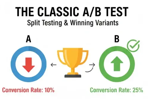
A/B testing is the engine that drives continuous conversion improvement by letting you compare variations and measure which performs better. Follow a hypothesis-driven process where every test starts with a clear problem, a proposed solution, and a predicted outcome. Prioritize your testing backlog using a framework like ICE scoring (Impact, Confidence, Ease) so you focus on high-value tests first. Run tests on sufficient traffic to reach statistical significance, typically requiring at least 1,000 visitors per variant and a p-value under 0.05 to be 95% confident your results are not random chance.
Avoid overlapping tests that could contaminate results, and test one variable at a time (headline, CTA color, form length) unless you have massive traffic that supports multivariate testing. Document every test in a shared log that includes hypothesis, setup details, duration, results, and learnings so your team builds institutional knowledge over time. Most testing programs see a 20% to 30% win rate, meaning one in three or four tests will successfully improve conversions. Even failed tests provide valuable insights about what does not work, helping you refine future hypotheses and avoid repeating mistakes.
Landing Page Optimization
Landing pages are purpose-built conversion machines with one job: get users to complete a specific action. Ensure message match between your ad or link copy and the landing page headline so visitors immediately recognize they are in the right place. Remove navigation distractions like header menus or footer links that give users an easy exit path before converting. Place social proof (testimonials, logos, stats) near the fold where it reinforces your headline and builds trust quickly. Use a concise form that asks only for essential information, and repeat your primary CTA at least twice on the page.
Test different elements systematically to find the winning combination of hero image or video, headline and subheadline, form length, trust signals, and layout. For example, Variant B might feature a shorter form (email and role only) with stronger proof elements above the fold, while Variant A uses a longer form with more qualification questions. Companies with 10 to 15 landing pages see a 55% increase in conversions compared to those with fewer pages, and sites with 40 or more landing pages experience over 500% more conversions. Build dedicated landing pages for each campaign, audience segment, or product to maximize relevance and conversion performance.
On-Site Notifications and Promotions
Non-intrusive sitewide notifications keep users informed about important offers, updates, or policies without disrupting their experience. Use a slim header bar or feed to display messages like “Free two-day shipping this week” or “New feature just launched” in a way that stays visible but does not block content. Test different placements (top versus bottom of the page), colors (high-contrast versus subtle), and timing (always on versus timed campaigns) to find what drives clicks without increasing bounce rates.
Rotate promotional messages based on user segment or behavior so returning visitors see different content than first-time users. Avoid overloading your site with too many banners, badges, or notifications because clutter reduces conversions and makes your site look spammy. Instead, choose one or two high-priority messages and give them prominence. Monitor click-through rates and conversions attributed to each notification to ensure they deliver value and do not distract users from completing their primary goal on the page.
Accessibility and Credibility Signals
Accessible design makes your site usable for everyone, including people with disabilities, and it builds trust with all users by demonstrating attention to detail and professionalism. Add descriptive alt text to all images so screen readers can convey meaning to visually impaired users. Ensure sufficient color contrast between text and background (at least 4.5 to 1 for body text) so content is readable in bright light or for users with low vision. Enable full keyboard navigation so users who cannot use a mouse can still complete forms and click buttons. Provide clear error states that explain what went wrong and how to fix it.
Display credibility signals like a physical address, phone number, email, and live chat hours in your footer and on contact pages so users know you are a real business they can reach. Add an About page or Team page with photos and bios to humanize your brand and build personal connections. Include links to your privacy policy, terms of service, and any relevant compliance certifications (GDPR, CCPA, PCI). These elements may seem small, but they collectively build trust and reassure users that you are legitimate, professional, and committed to protecting their data and rights.
Measurement Plan and KPIs
A clear measurement plan ensures you can track the impact of every item on your conversion rate optimization checklist and prove ROI to stakeholders. Map each optimization to specific metrics: overall conversion rate for site-wide changes, microconversion rates for individual funnel steps (PDP to add-to-cart, cart to checkout, checkout to purchase), form completion rates, cart abandonment rates, and revenue per visitor or lifetime value for ecommerce sites. Create annotated dashboards in your analytics platform so every test and major change is documented and you can see before-and-after performance at a glance.
Review your KPIs weekly or biweekly to spot trends, celebrate wins, and identify new opportunities. Track leading indicators like engagement metrics (time on page, scroll depth, clicks on key elements) alongside lagging indicators like completed conversions and revenue so you can diagnose problems early. Share dashboards and reports with your entire team so everyone understands how their work contributes to business outcomes. A strong measurement plan turns conversion optimization from guesswork into a science, making it easy to justify continued investment and scale what works.
Common Quick Wins
Some conversion rate optimization tactics deliver outsized results for minimal effort, making them perfect starting points if you are new to CRO or need to show quick progress. Compress your hero images and other large files to speed up page load by one or two seconds, which can lift conversions by 7% to 14% on its own. Clarify your headline to make your value proposition instantly clear, and make your primary CTA sticky on mobile so it stays visible as users scroll. Remove optional form fields to reduce friction and increase completion rates by up to 40%. Add key trust badges like Norton or McAfee near your checkout button or lead form to reassure users their information is secure.
Enable guest checkout so users do not have to create an account before purchasing, which removes a common objection and speeds up the buying process. Add an exit-intent popup offering a lead magnet (free checklist, ebook, discount code) to capture emails from visitors who were about to leave. Test each of these changes one at a time so you can measure impact and learn what works best for your audience. Even implementing just three or four quick wins can boost your overall conversion rate by 20% or more within a few weeks, giving you momentum and budget to tackle bigger, more complex optimizations.
Templates and Examples
To help you implement this conversion rate optimization checklist, download our free CRO audit template (PDF and Google Sheet versions), A/B test hypothesis worksheet, ICE prioritization matrix, and sample test log. These templates save you hours of setup time and ensure you follow best practices from day one. Our A/B hypothesis template guides you through defining the problem, proposed solution, expected outcome, success metrics, and minimum sample size so every test is rigorous and well-documented. The ICE prioritization sheet helps you score potential tests by Impact, Confidence, and Ease so you always work on the highest-value experiments first.
Review real-world examples to see how other companies applied these principles. An ecommerce fashion retailer redesigned their product pages with larger images, more prominent CTAs, and customer reviews above the fold, resulting in a 25% increase in conversion rate. A SaaS company reduced their signup form from five fields to three and saw a 40% jump in conversions. A subscription box service added a first-month discount offer and increased customer acquisition by 50%. Use these case snippets as inspiration and proof that systematic conversion rate optimization works across industries and business models.
Frequently Asked Questions
What is a good conversion rate?
The average conversion rate across all industries is 2.5% to 3%, but this benchmark varies significantly by industry, business model, and traffic source. Ecommerce sites typically see conversion rates between 2% and 3%, while SaaS and lead generation sites may achieve higher rates depending on their funnel complexity and target audience. Companies in the automotive, real estate, and travel industries tend to have higher average conversion rates, reaching up to 4% or more. Focus on beating your own baseline rather than comparing yourself to industry averages, because your starting point, traffic quality, and product offering are unique.
How long does it take to see CRO results?
Most A/B tests require 2 to 4 weeks to reach statistical significance with sufficient traffic volume, though high-traffic sites can sometimes get conclusive results in a few days. Quick wins like page speed improvements, fixing broken elements, or adding trust badges can show immediate improvements in conversion metrics within days of implementation. Comprehensive conversion rate optimization programs that include research, testing, and iteration typically deliver meaningful results within 6 to 12 weeks. Patience is important because running tests too short leads to false positives, while waiting too long delays learnings and slows your optimization cycle.
Do popups hurt user experience?
When used strategically, popups and lead capture prompts can boost conversions without harming user experience. The key is offering real value (discount, free resource, exclusive content), using behavior-based triggers like exit-intent or scroll depth rather than immediate display, making them easy to close with a visible X button, and avoiding intrusive tactics like showing multiple popups in one session. Avoid showing popups immediately on mobile because users are already navigating a smaller screen and an instant overlay feels aggressive. Test frequency, timing, and messaging to find the balance that captures leads without frustrating visitors or increasing bounce rates.
What should I test first?
Start by testing the elements that have the biggest potential impact and the least technical complexity. Page speed improvements, headline and value proposition clarity, CTA copy and placement, form length reduction, and trust signal additions are all high-impact, relatively easy changes that can lift conversions by 10% to 40% individually. Use analytics and heatmaps to identify your biggest drop-off points in the funnel, then prioritize tests that address those specific bottlenecks. If your product pages have high traffic but low add-to-cart rates, test different hero images, benefit-focused copy, or more prominent CTAs on those pages first.
What tools do I need for conversion rate optimization?
A solid conversion rate optimization toolkit includes analytics (Google Analytics or similar for tracking conversions and funnel performance), A/B testing software (Optimizely, VWO, Google Optimize, or built-in platform tools), heatmaps and session replay (Hotjar, Crazy Egg, FullStory), user feedback and surveys (Qualaroo, Typeform, on-site polls), and form analytics (to see field-level completion and drop-off). Many of these tools offer free tiers or trials, so you can start optimizing without a big budget. As you mature, consider adding more advanced tools for personalization, user testing, or advanced segmentation to take your program to the next level.